Identity Standards

Introduction

Celebrating the thriving ecosystems of the Galápagos Islands, the 19 Islands brand breathes life into the way the organization engages with both clients and the community.

For any questions regarding the application of the brand, please contact:

Joshua Jones
Principal
joshua@19islands.com

2854 Calgary Trail NW
Edmonton, AB
T6J 6V7
Logo

Wordmark

The 19 Islands brand was designed with a number of applications and mediums in mind. For brand consistency, it is important to use the following logos correctly.

The full-colour wordmark should be used on white or light coloured backgrounds. The wordmark should never sit directly on an image.

The full-colour wordmark remains the primary colour option. There is also a reverse wordmark for use on dark backgrounds, but this should be used sparingly.

In the event that materials must be printed in black and white, the full-colour wordmark in grey scale should be used.

Wordmark full-colour EPS or PNG

Wordmark reverse-colour EPS or PNG

Icon

The 19 Islands icon can be used on various materials as an aesthetic call out.

The full-colour icon should be used on white, or light coloured backgrounds. The icon should never sit directly on an image.

The full-colour icon remains the primary colour option. There is also a reverse icon for use on dark backgrounds, but this should be used sparingly.

Icon full-colour EPS or PNG

Icon reverse-colour EPS or PNG

Clear Space Agreement

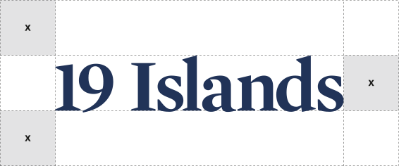
Always maintain the minimum clear space around the 19 Islands wordmark. The minimum protective space is X, where X is equal to the negative space in the wordmark. This space is required around all sides of the wordmark – including background edges and trims.

MINIMUM SIZE

Minimum size refers to the smallest at which the wordmark may be reproduced to ensure its legibility.

Colours

Colour Values

19 Islands is represented in one (1) primary colour and four (4) secondary principal colours. Each of the colours has a four-colour process (CMYK) breakdown and a Hex value specifically for online use.

All wordmarks, iconography, and typefaces are to be represented in the primary colour. Patterns and background colours can be represented in secondary colour palette. These colours are important to the brand identity system and must never be adjusted.

Primary Navy
C100  M87  Y36  K28
#1a315c

Blue – Pantone® 2727 C
C76  M49  Y0  K0
#2f7de1

Coral
C0  M64  Y57  K0
#f47d68

Yellow
C2  M9  Y73  K0
#fddf64

Green
C77  M7  Y55  K0
#20ab90

Typography

Type Usage

The following typeface should be used for all 19 Islands print applications. The use of this typeface will maintain a consistent and cohesive appearance on all materials.

Mercury Bold should be used for all headlines. Europa Regular should be used for all supporting copy including subheadlines. Font variants include alternate weights and oblique.

Type should be set in the 19 Islands primary navy colour. In greyscale applications, type should be set in black.

Mercury is available for purchase at typography.com/fonts/mercury-display/overview/

Europa is a Typekit font and can be found at typekit.com/fonts/europa

Limited Type Usage

When unable to work with the above typefaces, the fonts listed below can be used in place. Although these are adequate substitutions, they should only be used in situations where the primary typefaces are not available.

Ramaraja is a free Google font and is available at fonts.google.com/specimen/Ramaraja

PT Sans is a free Google font and is available at fonts.google.com/specimen/PT+Sans

Brand Usage